NEX Creations
A Case Study
With a vision of providing professional, quick yet affordable solutions, NEX Creations had to distinguish itself from the saturated market by engaging in a customised sales and project management portal, which can allow them to meet the needs of their clients and end-users both offline and online.
Duration September 2021 to January 2022
Responsibilities UIUX, Client Facing
Technologies Figma, Illustrator
Platform View Desktop and Mobile Responsive
Created with Quality Zone Technologies Pte Ltd
Company Background
NEX Creations, a design production house established in 2014. It specialises in various works from visual display system, design, manufacturing and even project management.
Problem
NEX Creations required efficiency and productivity to generate higher returns, while not relying on manual processes that can potentially hinder business developments.
Branding & Identity
Curating a spectrum of colours based on colours that NEX Creations had in mind.
Providing UI Options
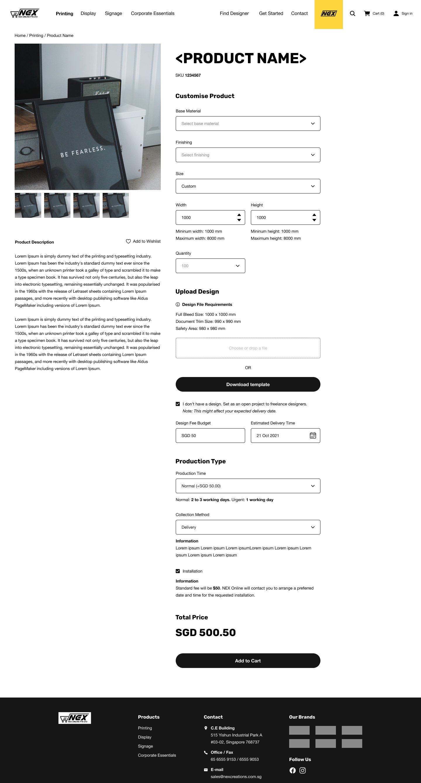
Focusing on the customer’s point of view, the UI has to be designed in such a way that it will be easy-to-use and clear in terms of the customer’s main objective – and that is to purchase products from NEX Creations.
These product can vary from small products like namecards, to large ones like wall murals.
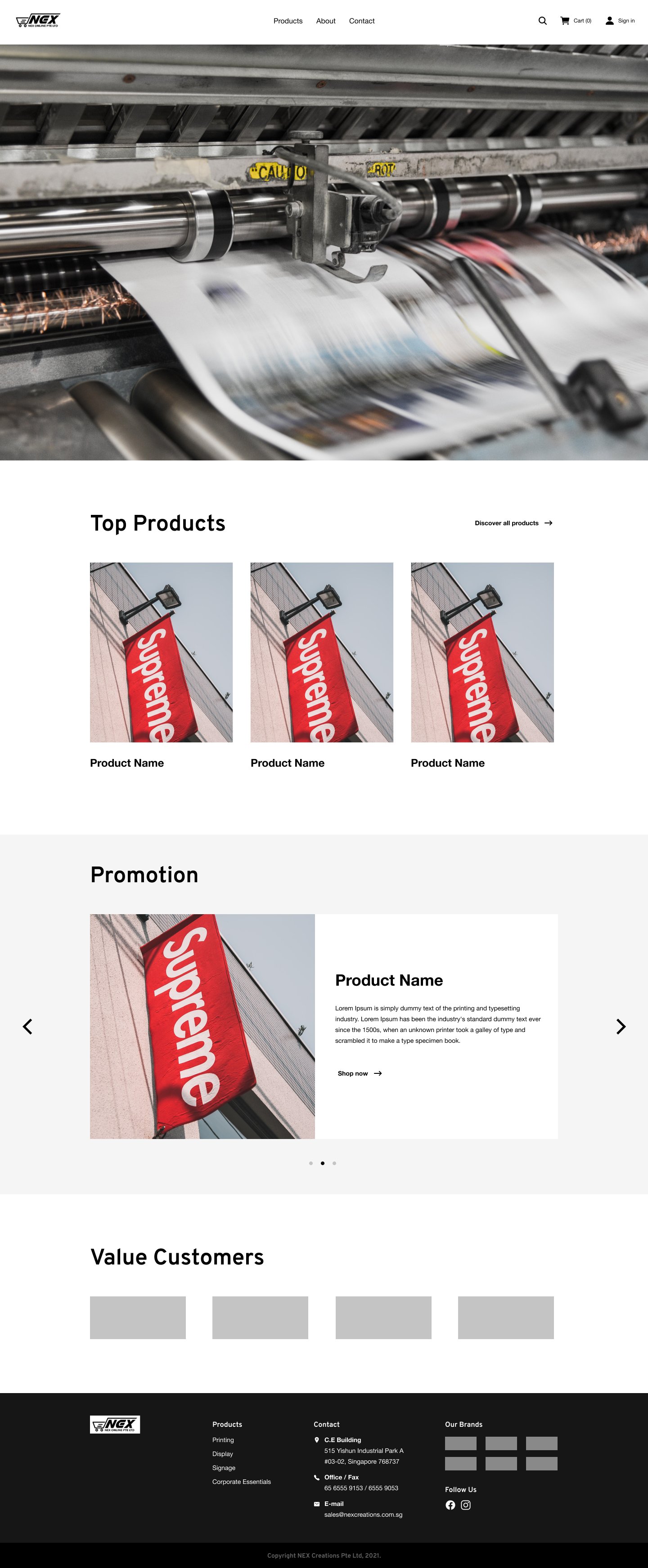
Theme 1: Spaced and Minimal
Theme 1 is focused on a modern and professional outlook – clean, sharp edges and nicely spaced elements all around the platform, which will give the end-users a comfortable experience when looking at a visual-focused platform.


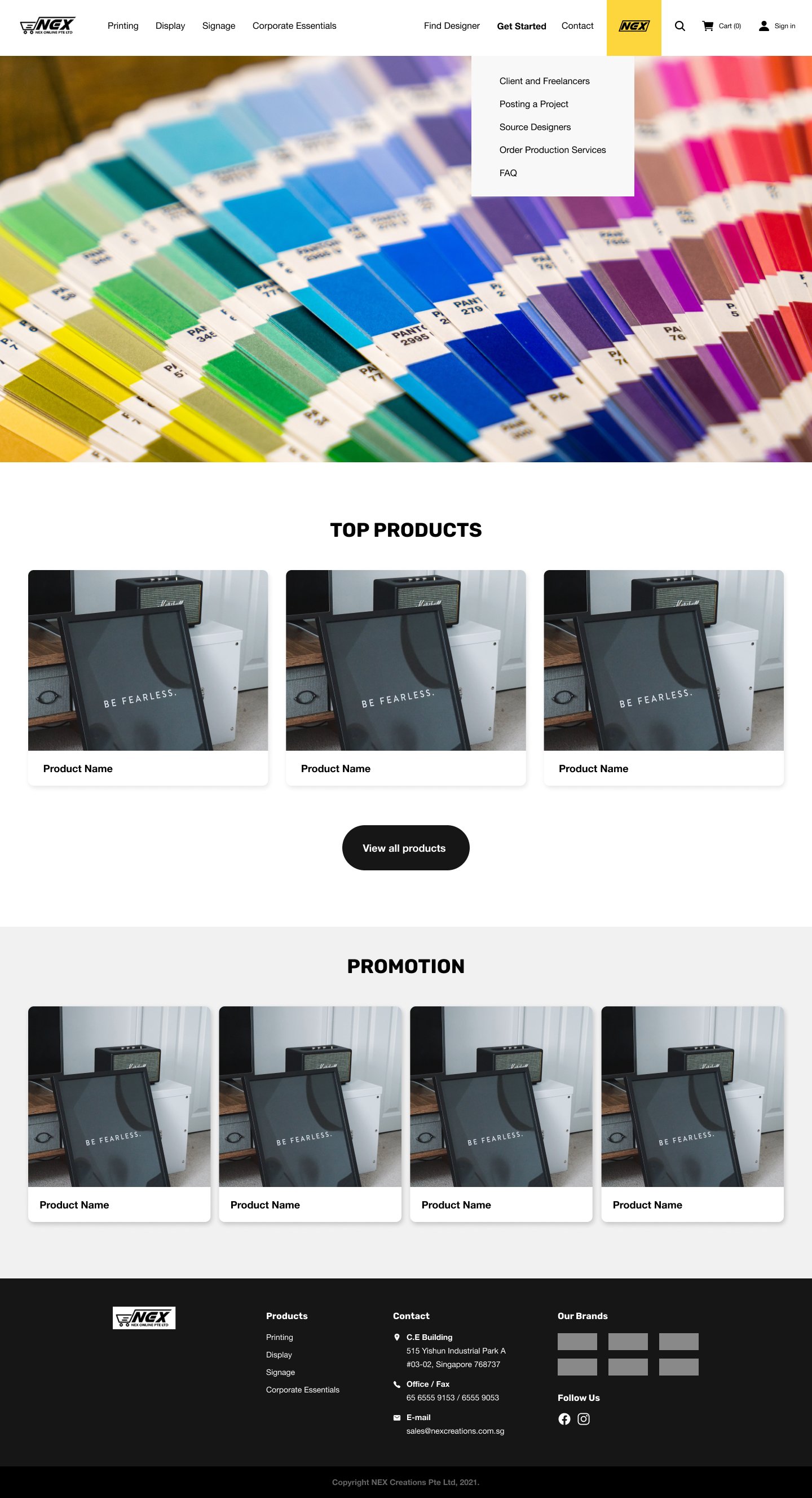
Theme 2: Stretched and Friendly
Theme 2 gives off a more friendly outlook with the rounded edges on all the elements within the platform. And with the stretched and evenly spaced elements, it allows the platform to maximise the real estate of the viewport by being able to show more of the visuals.


