Cue the Visuals / F.EAST: Rebranded
A research and experimental project using the User Experience Framework, where the importance of visual cues lie right about in the center. To also discover if visual cues have a strong impact in altering a consumer’s decision making process.
BA (Hons) Degree Final Year Project, 2019
Category: UI/UX, Branding, Video Editing, Graphic Illustration, Development

Problem Statement
To keep up with the competitive food market in Singapore is very difficult because in the country itself, the Food and Beverage (F&B) industry has more than 6,500 establishments. How would one local food business be able to stand out from the large, competitive crowd?
The use of visual cues can elevate the value of a brand. With the understanding of branding and the use of visual cues as a strategy, this research explores to utilise visual cues in the knowledge of branding within snack packaging designs. Therefore, this study aims to explore the practicality and implementation of visual cues in brand strategy in the context of Singapore’s snacking culture in hopes to develop a stronger strategy to combat competitiveness in the snack market.
User Experience Framework
Visual cues is connected to engaging in a User Experience – e.g. entering into an aisle in the supermarket that is overwhelmed with brands, colours, flavours, etc. We designers are responsible in shaping how users behave and interact with the given product. Hence, in the bubble of the term ‘User Experience’, the visuals lie right about in the center – where Persuasion comes first, followed by behaviour, visuals (design), usability, interaction and lastly, content.
Beginning of Research Work
Primary Research
Interviews and reviews
This study uses two different research methods, and they are qualitative and quantitative. The qualitative method consists of semi-structured interviews, while the quantitative method focuses on the reviews and feedbacks of the general public. The participants that have been mentioned earlier are involved in interviews that were conducted through e-mail and/or text conversation. Whilst the collated reviews and feedbacks from the general public were sourced from the organisations’ Facebook pages. Additionally, the methods were chosen to understand the importance and use of visual cues as a brand strategy to elevate brand’s value amongst avid snack eaters in Singapore.
Main motives for interviews
a) Investigating the existing efforts in Irvins Salted Egg that aims to satisfy their consumers’ needs.
b) Explore experts’ views on the concept and practicality of using visual cues as a brand strategy in the context of snack culture in Singapore, and its impact on their consumers.
c) Explore the possible opportunities for utilising visual cues as a brand strategy in accordance to the consumers’ needs.
The renowned experts
Participant A, who wishes to stay anonymous, is a social media and customer experience senior executive at Irvins Salted Egg, who leads the team in watching over what goes out on social media platforms and also mending the Facebook messages, E-mails, Instagram, and calls that customers send in.
Elie, an Assistant Design Manager at Irvins Salted Egg who manages the designs and concepts behind the brand.
Jemima Song, Design Director at The Ingenious Company who specialises in FMCG packaging designs.
Conducting surveys with the public @ National Museum Singapore
It was perfect timing that there is a packaging exhibition being held in National Museum Singapore, so I thought why not go there and conduct a survey at the same time while learning about how packaging have been developed in Singapore. It took me two days to conduct surveys and gather a total of 100 responses from the public.


Outcome + Results
Overall, the whole process of conducting the survey was nerve-wrecking because I don ’t do well in f acing the public and talking t o random strangers. But, for this project I have to step out o f comfort zone and do what is necessary in order to gain results.
The whole experience in the museum was an interesting one. When i first stepped in, it was quit e a small space, maybe a little too squeezy and not enough room for people t o walk around and have a clear view of the artefacts and in formation (that was what was t old t o me too by a lo t of the surveyors and their feedback on the whole exhibition).
I tried t o target more towards the millennials because that is m y target audience and so, her e are the summarised results for the surveys that I think is most important with regards to the project.
Evolution of ‘Cue the Visuals’
It was addressed by a designer in Singapore that one of her challenges when it comes to designing packaging is “helping clients understand the importance of a brand to support a successful packaging design. Due to the current crowded marketplace, the packaging design cannot exist in isolation, it has to also speak to customers through other touch points.”
Hence, the objective of this project is to firstly, find out what are the general public’s process of purchasing snacks – what are they looking for before purchasing, what interests them most in trying a new brand of snacks, and more importantly, do they get a certain type of feeling whenever they look at a particular packaging. Secondly, to collate and evaluate the surveyed results to gather insights. The insights will help in forming and designing the entire project and informing the importance of visual cues, not only on packaging, but on other means of design communication – print and digital.
Case Study: F.EAST
Rebranding F.EAST, a local snack brand in Singapore, because as compared to Irvins and The Golden Duck, from the look of their overall branding and packaging design, I see room for improvement in order to boost up their sales and recognition.
Irvins – est. 50k likes on Facebook, 3.2 out of 5 rated stars. Established on 2015.
The Golden Duck – est. 56k likes on Facebook, unknown rated stars. Established on 2015.
F.EAST – est. 6k likes on Facebook, unknown rated stars. Established on 2017
Understanding F.EAST as a Case Study
Applying the User Experience Framework
Conclusion
The factors that build insights that drive innovation and success for companies are the human needs, emotions and desires and their interaction with one another. With a comprehensive process and a theory that appeals to the majority, ensuring that the business society embraces a direction to better product development that surrounds the wants and needs of the public at its core can be achieved at great heights. What separates a company that is in a crowded market is the quality of experience of their users. Ironing out the people-problems will surely fix business issues. The only challenge is to draw businesses to put their beliefs in it, and have confidence in the designers to convey the right framework of user experience.
End of Research Work
Beginning of Concepts and Visuals:
Cue the Visuals


End of Concepts and Visuals: Cue the Visuals
Beginning of Concepts and Visuals:
F.EAST: Rebranded
First version of F.EAST: Rebranded
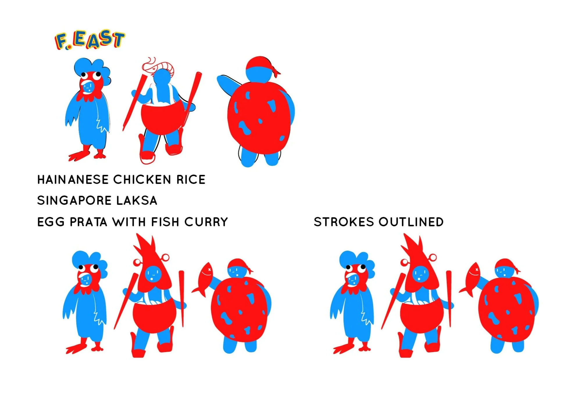
Using very bold colours, in this case, primary colours for experimental purposes. Also tweaked the art direction to be more 2-dimensional graphic illustrations.
User test products of first version
After rebranding F.EAST, it is always necessary to do a user test to gather insights and opinions from the views of others – whether they like it or not. And knowing where to improve from and what not to do. Here, I have revisited the same group of people to do a second user test with them with regards to website navigation and packaging design.
Development of F.EAST: Rebranded
Always consider the opinions and feedbacks from your target audience.


Meeting the Director of F.EAST
We met up on 3rd of May at 5pm at the lobby of the office building. We chatted about his company and the business side of things and where he hopes F.EAST will be in the near future. I also presented my ideas to him and also the feedback that I have gathered from my interviewees about his current branding and he was well interested in the ideas.
Addressing his concerns about his brand:
How can F.EAST be the ‘top of mind’ for consumers? When people say ‘potato chips’, how can people recall back F.EAST in their thoughts?
Getting people to actually try their chips
In hopes to create YouTube ads to further advertise F.EAST. But how can a six-second video be so impactful?
Feedback from the Director
Yue Jer showed well interest in the one-page scroll of the rebranded website and thought that it would be a great idea because of ease and convenience. He also shared his feedbacks with regards to the latest design concept that I have done up for his company. And hie feedbacks were:
The product packaging itself is a great idea to have because it is resealable and a lot of customers have addressed that concern.
However, there are several reasons why we stray away from that idea. And it is because where F.EAST falls under in the snack industry. There are 3 tiers, top being the premium which is costly, mid-range being the reasonable price, and last one is the cheapest. F.EAST, however, falls under the mid-range, where there are still customers complaining that their chips are still very expensive. With that, Yue Jer actually said, “That is why, you can never please anyone.”
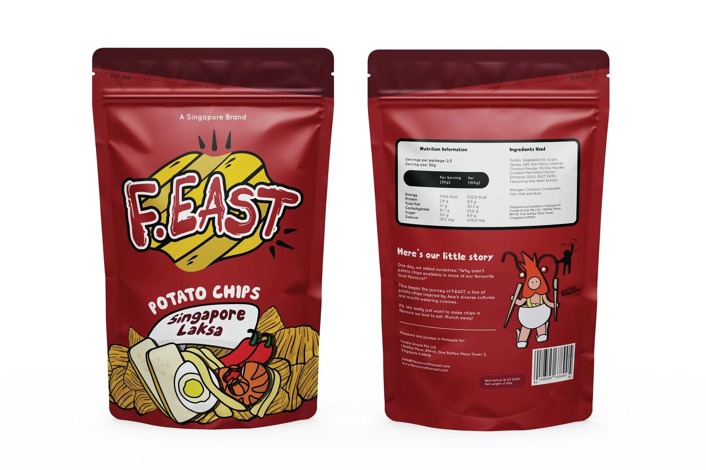
The colours looks good, but the overall look is rather bland because there is no bursting of flavours on the packaging. We just see plain chips. Maybe there could be added graphics of ingredients on the packaging?
Further Development of F.EAST: Rebranded
Always consider the opinions and feedbacks from your target audience, especially when it comes from the Director himself.
Design for consumers first
Since the websites are all made from scratch by me, I had struggled a lot in trying to solve and debug codes that don’t work for specific features. I’ve gone through many versions just to fix each bug. Every time I couldn’t solve one, I feel demotivated and discouraged. Because I would spend hours and days just to solve it in order for my website to function as I would love them to.
All these functions are also not decided by me. They are what the users want based on user testing and feedback. Hence, if I cannot achieve something that the users want, it gets really frustrating.
In coding, there are many solutions, and also, many problems. I want all my websites to be responsive so that users can view them easily through their phones, tablets, or even on desktop screens. The easy part is building it based on just one resolution. But when it comes to doing it for all devices, it gets a little crazy. Things will not work the way you want, they will shift onto some other areas that are so annoying to look at.
Hence, I have been taking the time to find many solutions in order for the responsive part to at least be decent looking. And the result has been this. With a lot of time and effort spent on debugging and figuring out alternatives in order for the website to at least please the general audience, I feel that this is already my best. What I can do at most is just to build up the design part and make it look attractive, but not too overwhelming as the feedback was that they’d prefer a clear, clean look. Nothing distracting to their eyes.
End of Concepts and Visuals: F.EAST: Rebranded
Final Product
The Verdict
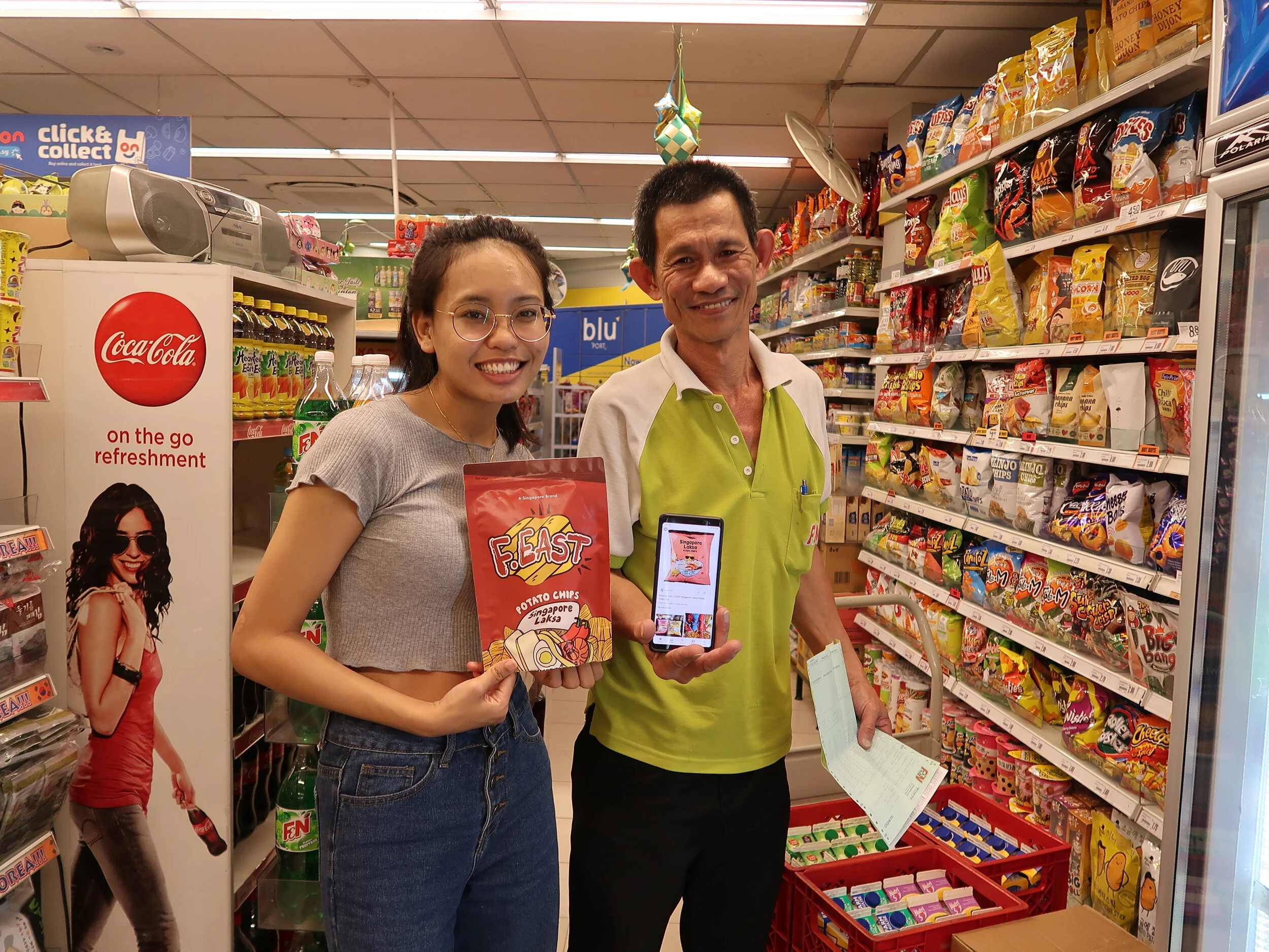
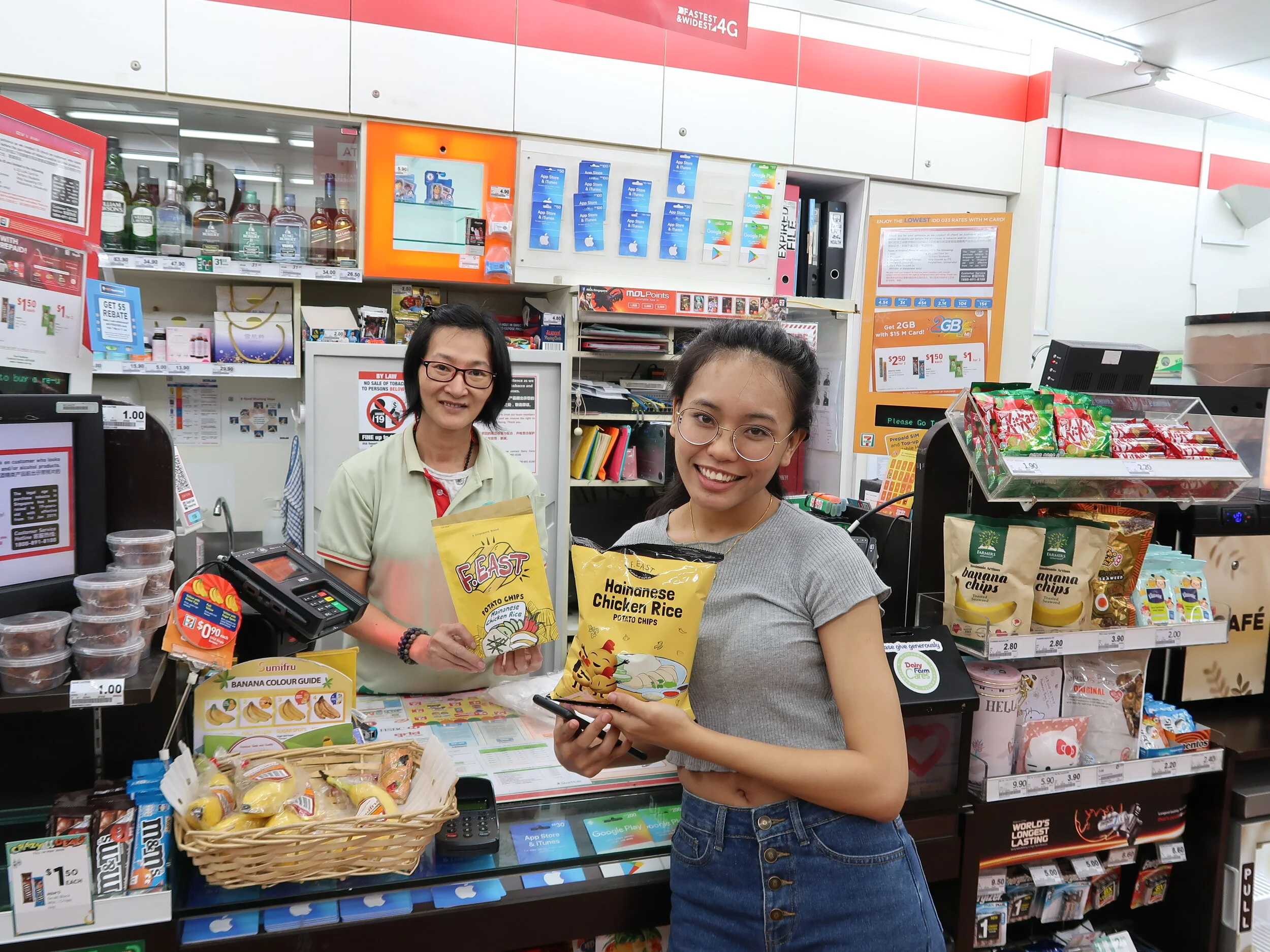
A final user testing was conducted to see which brand concept do the public prefer most. Although there were a few that did not want their photos to be taken, the overall result was that, they preferred the rebranded version of F.EAST. Mostly because, it looks more premium as compared to the existing one, it has loud, bright colours, clean and minimal look, and just looks more appetising. This user testing can be extended to more people, just to gather more views and thoughts. But, overall, I am pleased with what the public had decided on.
What I realise too was that, the older people preferred the existing packaging because it has quirky characters that makes them laugh and feel happy. Whilst the younger ones preferred a more aesthetic kind of outlook.


