City of Fireflies
An interactive information of Singapore bus services to enhance commuter’s user journey and experience by providing them with useful and relevant travel information, at their fingertips.
Diploma Final Year Project (Group), 2016
IXDA Shortlisted Entry 2016
Category: UI/UX, Branding, Video Editing
Problem Statement
There are a number of existing mobile applications for commuters living in Singapore to track their bus and train’s arrival time. However, these mobile application are purely informative, with no real-time update on the current location of bus/train.
We have to propose a user interface and information design to cater for the complex informational system, where user experience is key to extracting and imparting information relevant to a smooth and efficient journey. In simpler terms, we have to design a mobile application and information board so that users can have a better user experience while travelling in public transport.
Beginning of Research Work
Understanding who is our target audience
Who is our target audience? The daily commuters who simply just want to get to their destination on time via bus.
After finding out who are our target audience, we would then need to understand how they would generally commute to their destination – by creating user personas and user journeys, to have a clearer perspective.
User Persona #1
Chuna, 21 years old
Waiting for National Service, Part-time Delivery Boy at Pizza Hut
Location: North-South Region, Singapore
Description: A very laid-back individual, who loves to eat anything mint. Has the tendency to be aggressive when being accused of things he did not do. Also, he waskes up as early as 7am, even if there is nothing scheduled in the morning.
User Persona #2
Ali, 15 years old
Student
Location: North-East Region, Singapore
Description: A quiet teenager, whom is determined to study hard to excel. Does not retaliate when being accused, instead just accepts it. Listens and follows when being asked to do something by his parents. Sleeps as early as 9.30pm.
User Persona #3
Sally, 49 years old
Technician Officer
Location: East Region, Singapore
Description: A mother of 4 children. Often works over-time to cater to her children’s needs. Very straight-forward woman whom believes that her opinions are always right, but also paranoid.
Primary Research
Finding out the differences between Singapore’s existing bus services mobile applications.
How? We downloaded and evaluate them ourselves, first-hand.
Secondary Research
One of the secondary researches we did was to read off reviews online left from real users.
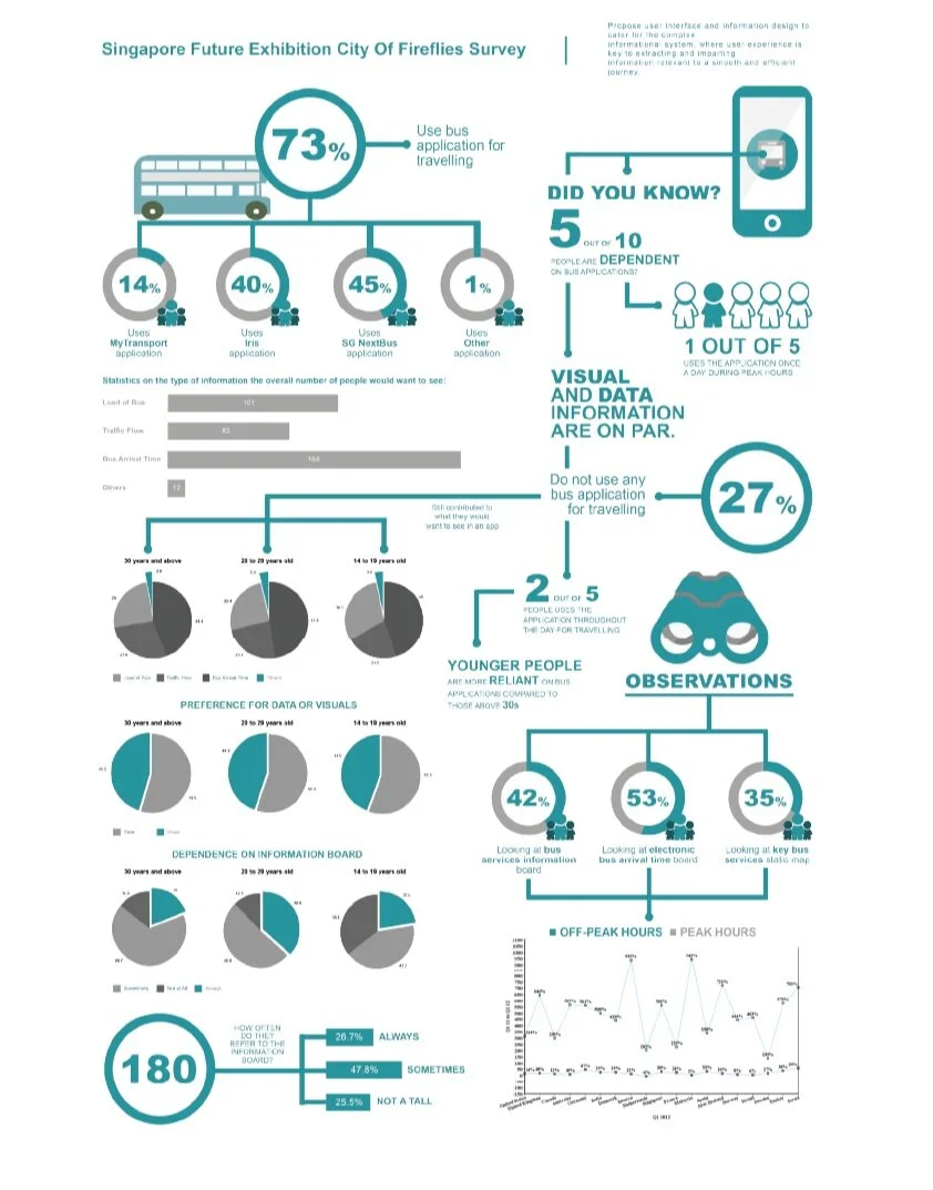
Another secondary research that we did was to carry out surveys both online and in multiple bus interchange in Singapore. We gathered feedback from different age groups:
14 - 19 years old
20 - 29 years old
30 and above
We also did observations in multiple locations – in our own neighbourhoods and in crowded areas like Jurong East and town. The observations that we carried out were:
Looking at information board
Looking at (electronic) bus arrival service number
Using phones while waiting for the bus
Looking at the watches
Looking at key bus services map
Using any bus applications
Main take-away?
46% wish to see the arrival time of the bus in an app.
28% wants to see the load of the bus in an app.
53% refers to electronic bus arrival time board.
73% uses bus application for travelling.
End of Research Work
Beginning of Ideation and Concept
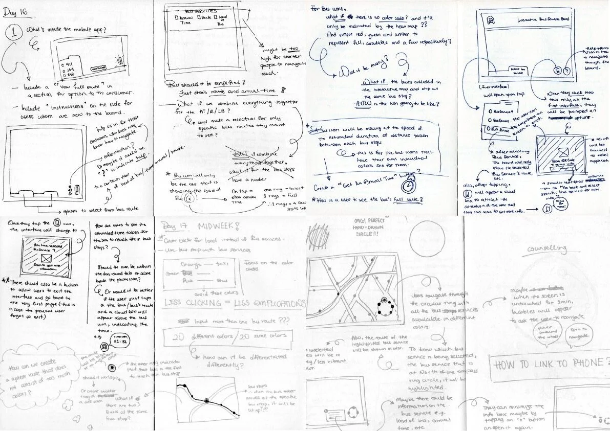
First ideas for an interactive bus info board
Thinking about how we can change up the static bus information board placed at every bus stops in Singapore.


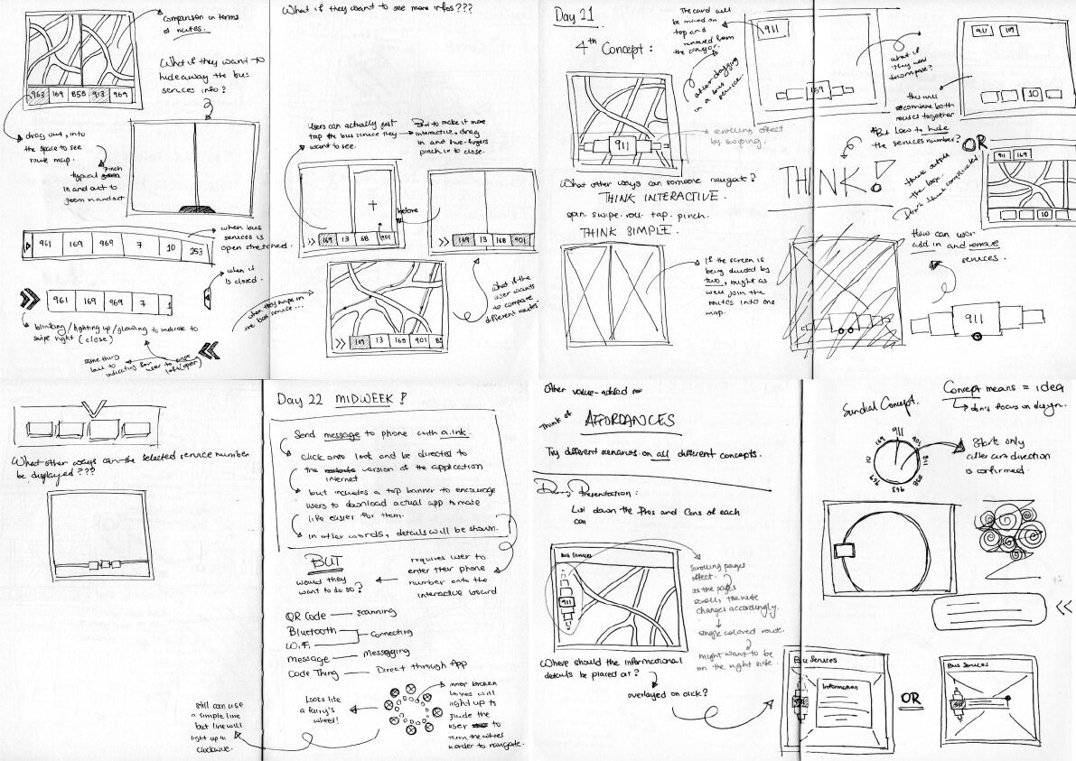
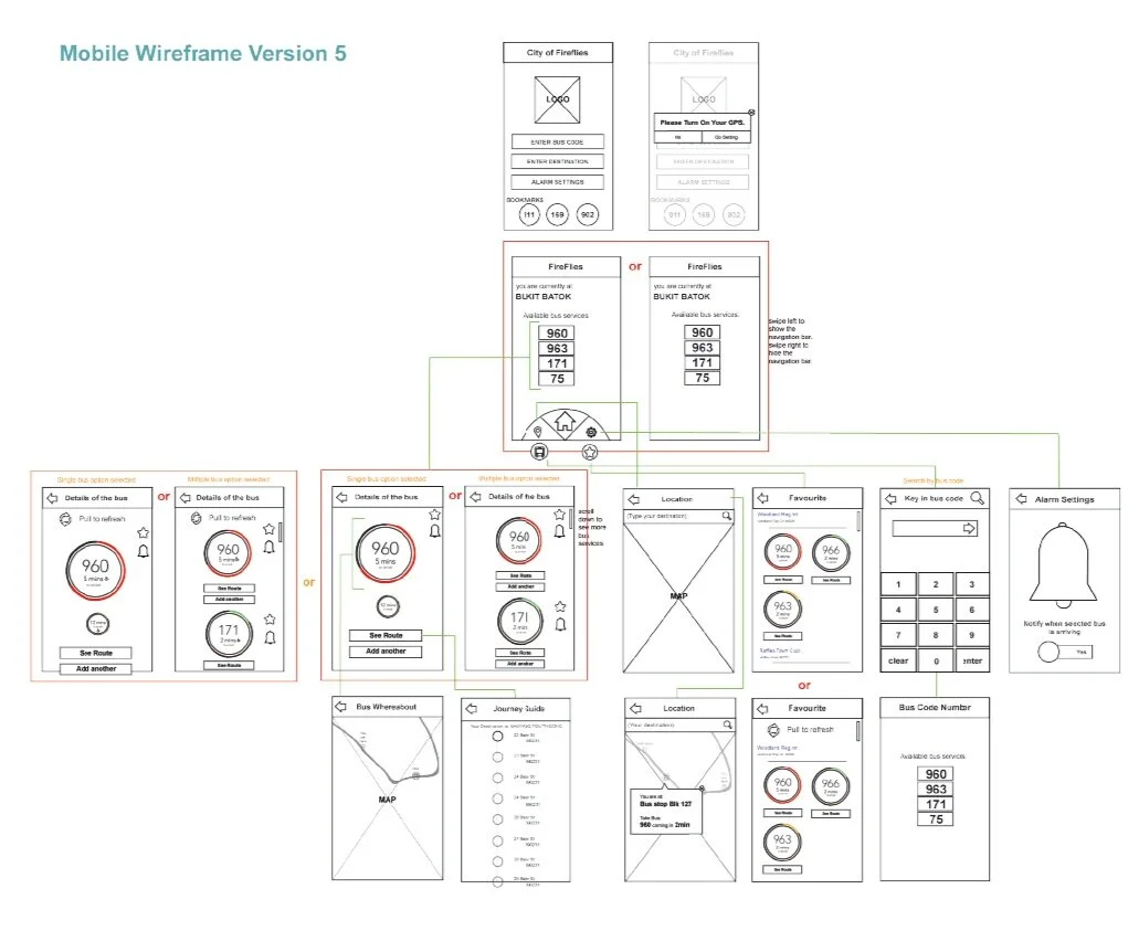
Wireframe to First Set of Mockups
Did a ton of sketches and wireframe to ensure that my concept makes sense in terms of usability and experience from navigating on the interactive board to the mobile application.
Box-Swipe Concept
On the interactive board, user can view a list of bus services available at the bus stop by scrolling on the left side of the screen.
Upon selection of a bus service, they will be able to view how full the bus is with commuters and estimated time arrival.
User can also view that data on their phones via two options:
Entering a code onto the interactive board after launching the mobile application.
Entering phone number onto the interactive board and get the data sent to the phone.
Extract-Combine Ideas
Each team member has created their own concepts. This allows us to have a variety of ideas and options to extract and combine into one whole satisfactory concept that will work best for our target audience.
End of Ideation and Concept
Beginning of Visuals
Wireframe for finalised concept
We have went through numerous versions of wireframe with after doing user tests at every version to have a proper structure and user experience flow, before potentially developing the product.
Art Direction + Colour Scheme
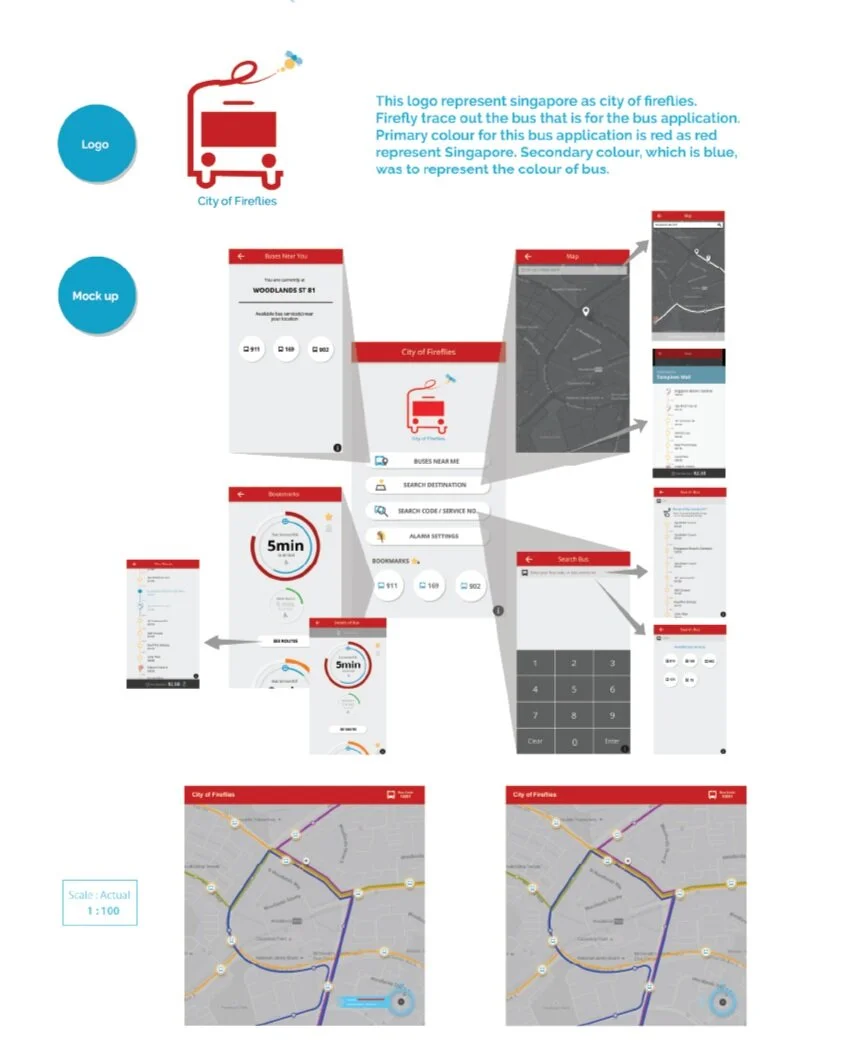
One of the first steps to creating a brand identity is to have a specific art direction that best fits the brand and it’s entirety. For City of Fireflies, the team and I had decided to go towards a simple, bold and new art direction.
Because City of Fireflies is a product based in and made for Singapore, it is only right to have the prominent red that is part of Singapore’s flag and identity.
Brand Identity
With the art direction and colour scheme in place, it will be easier to create create and instil the product’s brand identity.
Logo Design
A straightforward and simple logo icon that is created with the combination of a bus icon and a firefly. To make the design look a little more interesting and personalised, a little swoop in the line work at the top indicates the swiftness of the movement and trail of the firefly. This then relates back to how the product is quick and efficient in terms of allowing the users to get their information quick and easy.


Mockups + More User Tests
For every version, we did user testing to analyse what were the problems faced and to better enhance the interface of the mobile application and interactive board.
Insights from mobile application user tests
Tendency to swipe to go back to previous page of the application.
Did not know that the bus services were clickable (affordances).
At the map section, the users did not know that they could see the details of the bus.
Users wanted to see the subsequent bus details (users were afraid that they could not reach to their destination on time: journey planner page).
End of Visuals


